Analytics reports
Wix Analytics: Customizing Analytics Reports
Customize our pre-built reports so they show the info you need, the way you prefer seeing it. A clear view of your data helps you gain meaningful insights about your business and make data-driven decisions as a result.
Tip:
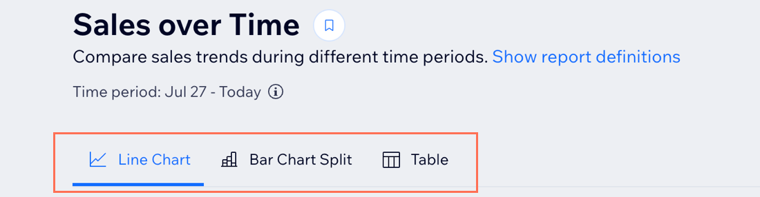
Switch between report views at the top to see the data displayed in different ways. Each view contains unique capabilities and customization options, with different metrics presented.
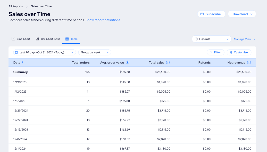
Customizing the table view
Tailor the table to your specific needs by adjusting the report's time period, filtering with advanced metrics, adding columns, and more. For example, filter sales reports to see orders placed online in the last quarter or add columns in traffic reports to get more details on visitors' session length.
To customize the table view:
Dashboard
Wix app
Wix Studio app
Go to All Reports in your site's dashboard.
Select the table view in the relevant report.
Choose what you want to do:
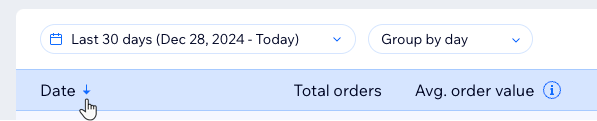
Change report dates
Change report dates to get the data you need for a certain time period. You can choose between preset time periods (e.g. Last 7 Days, Previous Month) or choose a custom date range (e.g. January 1, 2023 to March 15, 2024).
Click the date-picker drop-down at the top.
Note: It's set to Last 30 days by default.Select a preset period or create a custom date range.
Click Apply.

Group data by time period
In 'over time' reports, you can group data according to your preferred time unit. Click day, week, or month under the Group by drop-down to change the report.
Note: Grouping by week starts the week by the first day of the week as defined in your settings.

Add filters
Filter your reports with advanced metrics to only see the data you need. For example, in sales reports you can choose to see only specific service types or payment methods.
Click Filter.
Select filters under a value.
Click Apply.
Note: To remove values from the filter, click the X next to a filter or click Clear to remove them all.

Add or remove data columns
Add or remove columns to only see the data you need. For example, tailor a report to only include customer details or orders and payment information. You can also drag columns to re-order the table.
Click Customize.
Select the checkbox next to the column(s) you want to add.
Tip: Deselect the checkbox to remove it from the table.(Optional) Drag and drop columns to reorder the table.

Tip:
Change the sort order of the table by clicking the arrow in the header. What the table sorts by depends on the report type.
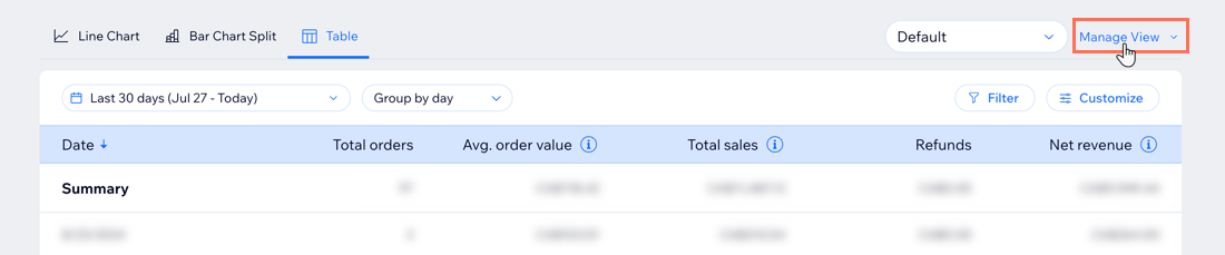
Saving a custom table view
Edit your table view to display the fields and filters that work for you, then save that view so you can easily access it again. You can have multiple views to switch between, depending on the data you want to see.
Note:
This feature is only available in the table view.
To save a custom view:
Go to All Reports in your site's dashboard.
Select the Table view in the relevant report.
Customize the table view as you wish.
Select Save as new view under the Manage View drop-down on the right.
Enter a name for this new view.
Click Save.
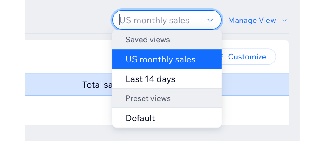
Managing custom table views
Once you have saved report views, you can manage and edit them. Make changes to a saved table view, choose which view is the default table view for the report, edit the name of a view, or delete a view.
Note:
This feature is only available in the table view.
To manage your custom report views:
Go to All Reports in your site's dashboard.
Select the Table view in the relevant report.
Select a saved view from the drop-down.
Click the Manage View drop-down on the right.
Choose what to do:Save changes: After you make updates to a saved view, save those changes.
Save as new view: Save the current view as a new, separate view.
Rename: Rename a saved view.
Set as default view: Make this the default view that appears when you select the report.
Delete: Delete this view from the list.
What's next?
Download or subscribe to your reports.
Customizing other views
You have additional options for viewing reports that present data in different ways (e.g. bar charts, heat maps). Customize a report view to highlight relevant information. The types of visualizations and customization options vary depending on your selected report.
Notes:
This section covers all report views (e.g. line charts, bar charts) except for the table view.
Some views limit the amount of data shown and how far back it goes. If you can't get to the data you need, switch to a different view.
To customize your view:
Dashboard
Wix app
Wix Studio app
Go to All Reports in your site's dashboard.
Select the relevant report.
Choose what you want to do:
Change report dates
Change report dates to get the data you need for a certain time period. You can choose between preset time periods (e.g. Last 7 Days, Previous Month) or choose a custom date range (e.g. January 1, 2023 to March 15, 2024).
Under Select a time period, click Last 30 Days.
Select a preset period or click Custom to create a custom date range.
Tip: Click More to see more preset options.

Add filters
Filter your reports with advanced metrics to only see the data you need. For example, in sales reports you can choose to see only specific service types or payment methods.
Click More next to the report options.
Tip: The number next to it (e.g. 23) shows you how many filter options are available.Select the values next to the relevant filter to apply them to your report.
Note: To remove values from the filter, uncheck the box next to the value name or click the X to remove them.

Select a measure
Select the value by which you'll be measuring the data. For example, in a Traffic over Time report you can choose to view the number of site sessions or the average session duration.
Under Select a measure click the current measure displayed, then select a different measure in the drop-down.

Group data by time period
Group data in your chart view according to your preferred time unit. Under Group by, click Day, Week, or Month to change the report.

Compare report periods
Compare report data from different periods to discover how your business has performed in different time periods. For example, when you access your Sales Over Time report, you can check how your online store did this year compared to last year.
Select an 'Over Time' report.
Select a period under Compare to:None: Is selected by default, only shows the current selected period.
Previous period: Compares the current selected period to the period before. For example, compare this month to the month before it.
Last year: Shows how your data changed this year versus the year before.

(Bar Chart Split view) Split report data between different metrics
With the bar chart split view, you can split the data to get a better look based on a specific metric you choose. For example, in the Traffic Over Time report, split data by visitor type to see how many new and returning visitors your site received each day.

Tip: Hover over the report to view exact stats (e.g. the specific date and number of returning visitors).
FAQs
Click a question below to learn more.
Can I reset a report?
You can return to the report's default view to remove all changes and return to the way the data was initially presented.
Table view: Select the Default view from the drop-down in a report.

Other views: Click the More Actions icon  in a report and select Reset filters.

Can I share Analytics reports with my team?
By default, pre-built Analytics reports are visible to all site collaborators with permission to view Analytics data.
You can check which permissions each role has in your site dashboard.
Go to Roles & Permissions in your site's dashboard.
Click Manage Roles.
Hover over the role you want to check and click View / Edit.
Scroll down and click Analytics. If View Site Analytics is checked, that means they have permission.

Learn more about roles and permissions on your site.
Can I share a report view that I created?
No, report views are only visible to yourself.
