Designing your blog
Wix Blog: Customizing Your Blog's Mobile View
Customizing your blog's mobile view allows you to create a seamless and engaging experience for visitors using mobile devices. For example, if you run a travel blog, optimizing the blog's mobile view ensures that your stunning travel photos and detailed itineraries look great on smartphones, making it easier for your readers to follow along on their own adventures.
Note:
This article refers to steps for the Wix mobile editor only. Learn how to customize the mobile view for a site using the Studio Editor.
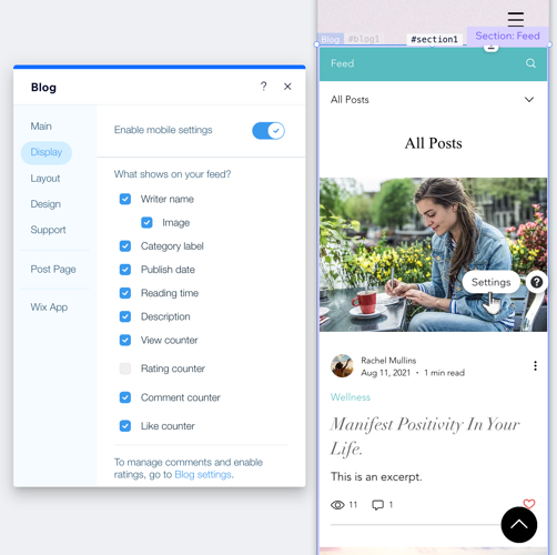
Customizing the mobile view of your blog feed
Optimize your blog feed to suit a mobile screen by changing the settings. You can choose what is displayed on the screen, change the layout, and adjust the font size.
To customize the mobile view of your blog feed:
Go to your mobile editor.
Go to your Blog page:Click Pages & Menu
 on the left side of the editor.
Click Blog Pages.
Click your Blog page.
Click the blog feed element on your page.
Click Settings.
Choose what you want to customize:
Display
Mobile screens are smaller than regular screens, so you might want to hide certain information which is less important to your readers.
Click the Display tab.
Enable the Enable mobile settings toggle.
Customize the following:What shows on your feed: Select or deselect the relevant checkboxes to show/hide certain elements on your feed.
Blog menu: Enable the toggle and select what shows on your blog menu.
Social sharing: Enable the toggle and select the icons shown on your feed.
Layout
You can change the layout of the main post feed as well as the category page.
Click the Layout tab.
Click the All Posts feed tab.
Customize the All Posts feed layout:Choose a layout for the main post feed.
Choose the alignment for the text.
Click the Category feed tab.
Customize the Category feed layout:Choose a layout for the category page.
Choose the alignment for the text.
Design
You can change the size of the font that appears on the main post feed as well as the category page.
Click the Design tab.
Choose what you want to customize:Posts: Adjust the title and description font of your All Post feed and Category feed.
Category labels: Enable the Enable mobile settings toggle and customize the category labels, text padding and category style.
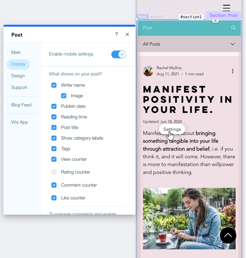
Customizing the mobile view of your post page
Optimize your post page to suit a mobile screen by changing the settings. Show or hide certain elements, change your layout and customize the font size.
To customize the mobile view of your post page:
Go to your mobile editor.
Go to your Post page:Click Pages & Menu
on the left side of the editor.
Click Blog Pages.
Click Post.
Click the Post page element on your page.
Click Settings.
Choose what you want to customize:
Display
Mobile screens are smaller than regular screens, so you might want to hide certain information which is less important to your readers.
Click the Display tab.
Enable the Enable mobile settings toggle to customize the mobile display.
Customize the following:What shows on your post: Select or deselect the relevant checkboxes to show/hide certain elements on your post.
Blog menu: Enable the toggle and select what shows on your blog menu.
Social sharing: Enable the toggle and select the icons shown on your post.
Related posts:Show related posts: Enable/disable the toggle to show or hide related posts.
Display post label: Enable/disable the toggle to show or hide post labels. If enabled, select Related posts or Recent posts.
Show "See All" link: Enable/disable the toggle to show or hide a link to your post.
Design
Click the Design tab.
Drag the sliders to increase or decrease the font sizes of your paragraphs and headings.