Connecting CMS collection content to your site
CMS: Displaying Collection Content in a Pro Gallery
Use a pro gallery to dynamically display images for each item in your CMS (Content Management System) collection. You control which 'Image' field to use for each item, while also connecting collection fields to the image titles, descriptions, alt texts, and links. This type of setup is ideal for both dynamic list pages and static pages, as you can link the images to their items' dynamic item pages.
Important:
This article refers to connecting a pro gallery to an 'Image' field used for displaying one image per collection item. Alternatively, you can connect a pro gallery to a 'Media Gallery' field used for displaying several images or videos for a single collection item on a dynamic item page.
Step 1 | Create a CMS collection
Create a multiple item collection for storing the images you want to show in the gallery. Add an image field type and text fields for the image titles, descriptions and alt text. Then add the images and values for each item in the collection. If needed, you can adjust the collection permissions from their default 'Show content' setting that allows anyone to view the content.
To create a collection for storing gallery images:
Wix Editor
Studio Editor
Dashboard
Go to CMS in your site's dashboard.
Click Create Collection.
Click Start from scratch.
Tip: Alternatively, click Create with AI to let AI (Artificial Intelligence) create a collection for you.Click Next.
Enter a name for your collection.
(Coding only) Enter a collection ID to use in your code.
Leave Multiple item collection (Default) selected and click Create.
Add fields to your collection manually or by importing a CSV file:Add fields manually: Click + Add Field to begin adding fields to your collection manually.
Import a CSV file: Click Import CSV file to upload a CSV file to your collection.
Tip:
Make sure to add an 'Image' field type to store images for each item. You can also add 'Text' field types for use as the image titles, descriptions and alt text.
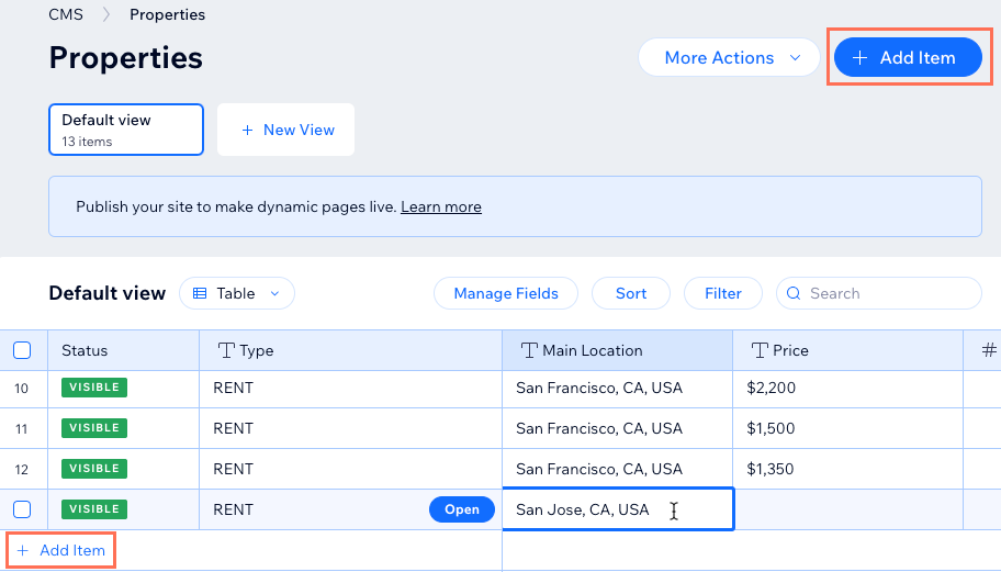
Add items to your collection:Click + Add Item.
Add content about the item to each relevant field.
Repeat this step to create as many items as you need.
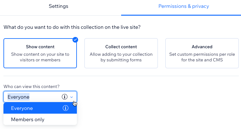
Set the collection permissions:Click More Actions and select Permissions & privacy.
Choose which permissions you want the collection to have:Show content: Allow everyone or only site members to view the collection content on your live site. Admins and collaborators with CMS access always have full access to view, add, update, or delete collection items.
Collect content: Allow everyone or only site members to add new items to the collection from your live site with input elements or API. Also, specify who can view the content. Admins and collaborators with CMS access always have full access to view, add, update, or delete collection items.
Advanced: Set custom permissions for each user role to control who can view, add, update, or delete collection content. Admins and collaborators with CMS access have full access. However, you can set permissions for specific collaborator roles to restrict their access to the collection.
Click Save.
Step 2 | Connect a pro gallery to your collection
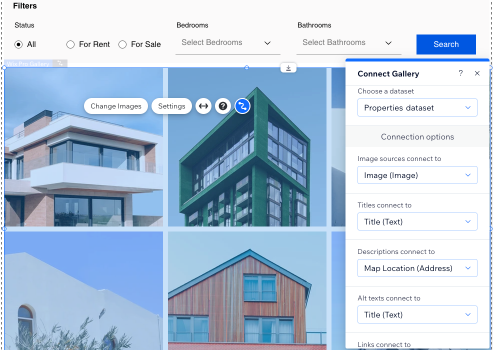
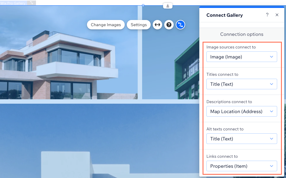
Add a pro gallery to your site and connect it to a dataset that binds to your collection fields. Then connect the gallery's image sources to your collection's image field. You can also connect the titles, descriptions and alt text to fields in your collection. Use the 'Links connect to' drop-down to link the items to their dynamic item pages, or to a 'URL', 'Image', or 'Video' field.
Wix Editor
Studio Editor
Go to the page where you want a gallery to display images representing different collection items.
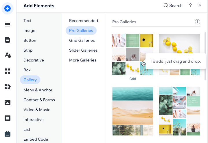
Click Add Elements
 on the left side of the editor.
Click Gallery.
Click and drag the pro gallery you want to use onto the page.
Remove the default images from the gallery:Click Manage Media on the gallery.
Click Select All, then click Delete.
Click Done.
Click the Connect to CMS icon
 .
.Click the Choose a dataset drop-down and select an existing dataset that connects to your collection. Alternatively, select Add a Dataset, then choose the collection you want to connect.
Click the relevant drop-downs to connect your collection fields to the gallery:Image sources connect to: Select the 'Image' field you want to display.
Titles connect to: Select the field you want to use for the image titles.
Descriptions connect to: Select the field you want to use for the image descriptions.
Alt texts connect to: Select the field you want to use for the image alt texts.
Links connect to: Select the dynamic page, 'URL' field, or 'Image' field you want to link the images to.
Click the gallery and select Settings to customize your gallery's layout, design, and more. Learn more about customizing your pro gallery.
Step 3 | Manage the dataset settings
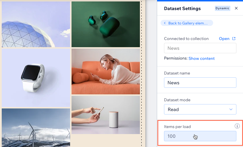
Go to the dataset settings to set the total items that can load at a time, filter certain items from appearing, sort the order in which the items display, or change the dataset mode. Set the mode to 'Read & Write' if you plan on letting visitors update the gallery's connected collection items.
Wix Editor
Studio Editor
Go to the gallery's connected dataset settings:Click the gallery.
Click the Connect to CMS icon .
Click Dataset Settings in the Connect Gallery panel on the right.
(Optional) Click the permission type next to Permissions to determine who can view, add, update, or delete collection content.
(Optional) Click the Dataset name field if you need to edit the name of the dataset.
(Velo only) Click the Dataset ID field to edit the ID used to identify the dataset in your page's code.
Click the Dataset mode drop-down and select the relevant option:Read: Connected elements can read and display content from your collection. The elements cannot modify the collection content.
Read & Write: Connected elements can display content from your collection. Input elements can add or edit content in your collection.
Edit the Items per load field to set the maximum number of items that can load at a time.
Note: This is also the maximum number of items that can load when visitors click 'Load More' buttons, 'Next/Previous page' buttons, or pagination bars. See the next section for steps.
(Optional) Click + Add Filter to only show specific items in the gallery.
(Optional) Click + Add Sort to choose the order in which collection items appear in the gallery.
Step 4 | (Optional) Create 'Load More' or navigational buttons
You can improve your page's loading performance by adding a 'Load More' button if you have a lot of collection items. Your dataset's 'Items per load' field can be set as high as 1000 items. It controls how many items can initially load in your gallery, and how many additional items can load when visitors click the 'Load More' button.
This field also determines the number of items displayed per 'page' in your gallery if you connect 'Next/Previous page' buttons or a pagination bar.
Wix Editor
Studio Editor
Choose what you want to do:
Create a 'Load More' button
Add a button to your page:Click Add Elements
on the left side of the editor.
Click Button, then drag the button onto your page where you want it to appear (e.g. below the gallery). Do not place the button on top of the gallery.
Tip: Alternatively, you can add an image and use it as your 'Load More' button.
Click Change Text and enter the text you want to display on the button (e.g. "Load More").
Click the Connect to CMS icon
.Click the Choose a dataset drop-down and select the same dataset that connects to your gallery.
Click the Click action connects to drop-down and select Load more.

Click the button and select the Design icon
 to customize the appearance of your 'Load More' button.
Click Preview to test your 'Load More' button.
Click Publish if you are ready to make the changes go live.
Create 'Next Page' and 'Previous Page' buttons
Add a 'Next Page' button to your page:Click Add Elements
on the left side of the editor.
Click Button, then drag the button onto your page where you want it to appear (e.g. below the gallery). Do not place the button on top of your gallery.
Tip: Alternatively, you can add an image and use it as your 'Next Page' button.
Click Change Text and enter the text you want to display on the button (e.g. "Next Page").
Click the Connect to CMS icon
.Click the Choose a dataset drop-down and select the same dataset that connects to your gallery.
Click the Click action connects to drop-down and select Next page.

Click the button and select the Design icon
to customize the appearance of your 'Next Page' button.Duplicate your 'Next Page' button:Right-click the button (control + click on Mac).
Select Duplicate (or press Ctrl + D or ⌘ + D on Mac).
Click and drag the button where you want it to appear. Do not place it on top of your gallery.
Click Change Text and enter the text you want to display on the button (e.g. "Previous Page").
Click the Connect to CMS icon
.Click the Click action connects to drop-down and select Previous page.

Click Preview to test your 'Next Page' and 'Previous Page' buttons.
Click Publish if you are ready to make the changes go live.
Connect a pagination bar
Note: Pagination bars are not relevant for static pages or dynamic item pages that can only display 1 item at a time.
Add a pagination bar:Click Add Elements
on the left side of the editor.
Click Interactive.
Click Pagination Bar.
Click and drag the pagination bar you want to use onto the page.
Click Change Layout to adjust the layout.
Click the Design icon
 on the pagination bar to edit the design.
Click the Connect to CMS icon
 .
.Click the Choose a dataset drop-down and select the same dataset that connects to your gallery.

Click and drag the edges of your pagination bar to resize it.
Click Preview to test your pagination bar.
Click Publish if you are ready to make the changes go live.
View a full tutorial on adding and setting up a pagination bar.
FAQs
Click below for answers to the most frequently asked questions about connecting a gallery to the CMS.
How can site visitors filter the content that appears in the gallery?
To let site visitors filter the gallery content, connect input elements such as dropdowns or radio buttons to the same dataset that connects to your gallery. View a step-by-step tutorial for allowing visitors to filter content with input elements.
Can I set the gallery image links to open when clicked?
By default, expand mode opens when visitors click an image in a pro gallery. In expand mode, the image displays in an enlarged window with the title, description, and link on the side. Visitors can then click the link to go to the destination you set in the gallery's connection options (see Step 2 | Connect a pro gallery to your collection).
If you prefer, you can disable expand mode and set the gallery to open the links when visitors click the images.
To set the links to open when visitors click images in the gallery:
Click the pro gallery element in your editor and select Settings.
Click Settings on the left.
Click the drop-down under Gallery Settings and select A link opens.

What are the CMS connection options for this gallery?
The connection options allow you to specify how different parts of the gallery link to specific fields in the collection.
Connect the following options to collection fields:
Image sources connect to: The images you want to display in the gallery.
Titles connect to: The fields used for each item's title in the gallery.
Descriptions connect to: The fields used for each item's description in the gallery.
Alt texts connect to: The fields used for each item's alt text in the gallery.
Links connect to: The fields or dynamic pages you want to link each item to.
Why doesn't my pro gallery's 'Load More' button respond to the dataset settings?
The pro gallery has a built-in 'Load More' button that can restrict the number of media items displayed in the gallery.
If you enable this 'Load More' button in the gallery's layout settings, it uses these settings to determine when to appear and how many more images load. With the gallery's built-in 'Load More' button, the dataset's Items per load setting determines the aggregate total maximum items that can load in the gallery. However, it no longer determines how many items initially load in the gallery or how many additional items load when visitors click this 'Load More' button.

Consider the type of collection field your gallery connects to when deciding which 'Load More' button to use:
'Image' field type: If your gallery connects to an 'Image' field used to display only 1 image per collection item, create a 'Load More' button that connects to the dataset.
'Media Gallery' field type: If your gallery connects to a 'Media Gallery' field used to display several images per collection item, use the gallery's built-in 'Load More' button. Learn how to enable the 'Load More' button in the pro gallery's custom layout settings.
